Choose Skin

Image Box Widget


Using Image Box Widget is similar to using Image Widget with the only one exception : Image Box presents a common container (box) within which you can add an image on one side and text content (with a headline and text) on the other. Image Box is often used in features sections, as an alternative to using the Icon Box. In XRipe Website Builder, column element acts as container for the Image Box. It is important to bear this in mind when editing the Image Box properties. In most occasions, you will not find any need to touch the container-column.

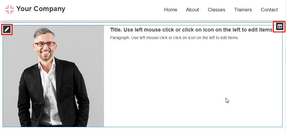
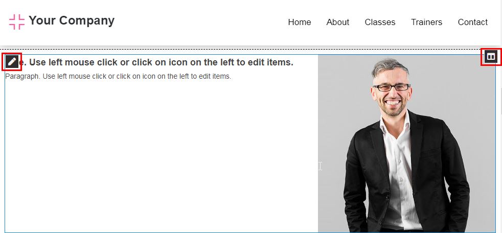
Withing the Image Box, you have the option of aligning both the image and the text content the way you deem fit - left, right or center (see image below).
For uploading image(s) into the Image Box, please see: Image Widget

Image Box Properties

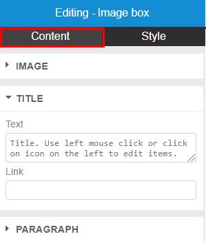
Content

IMAGE
  • Thumbnail size of the image. To edit/crop/replace/download the image, click on it - opens the Media Manager modal page
TITLE
  • Text - enter the title/heading text of the Image Box content. Also called section heading
  • Link - enter the link (URL), if any, of title/heading text of the Image Box content
PARAGRAPH
  • Paragraph - enter full text (or body text) of the Image Box content. Rich-edit formatted text can be applied
XRipe : website builder image box widget edit content

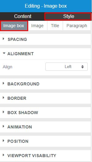
Style

Image Box
SPACING
  • Margin top - drag the slider button left or right to indicate the margin area (in pixels) between Image Box element and neighboring element top of the box
  • Inner spacing - drag the slider button left or right to set the Inner Spacing (in pixels). Horizontal - same as left and right margins. Vertical - same as top and bottom margins. Inner spacing is also known as padding, and is the space inside Image Box borders. When you adjust the outer spacing and inner spacing of a widget, you change its placement and appearance.
ALIGNMENT
  • Align - set position of the image in relative to the text content - left, center, right. Default is left.
Left-aligned - aligned with a left edge. Right-aligned - aligned with a right edge. Centered - centered between two edges.
BACKGROUND
  • Background color - choose the background of the Image Box
BORDER
  • Border radius - set border radius of the image box. The border radius property rounds the corners of an element's (Image Box) outer border edge.
  • Border style - set border style of the Image Box - Default, None, Solid, Dotted or Dashed
BOX SHADOW
  • Box shadow - set the box shadow of the Image Box - Default, None, Outside, Inside. The box shadow property adds shadow effects around an element's frame.
    • Horizontal - offset of the shadow, positive means the shadow will be on the right of the box, a negative offset will put the shadow on the left of the box
    • Vertical - offset of the shadow, a negative one means the box-shadow will be above the box, a positive one means the shadow will be below the box
    • Blur -radius of the shadow, if set to 0 the shadow will be sharp, the higher the number, the more blurred it will be, and the further out the shadow will extend. For instance a shadow with 5px of horizontal offset that also has a 5px blur radius will be 10px of total shadow
    • Spread - radius of the shadow, positive values increase the size of the shadow, negative values decrease the size. Default is 0 (the shadow is same size as blur)
    • Color - set the color of the box shadow. If the color value is omitted, box shadows are drawn in the foreground color (text color). But be aware, older WebKit browsers (pre Chrome 20 and Safari 6) ignore the rule when color is omitted.
ANIMATION
  • On show animation - select animation option: Default, None or Animate
  • Animation - select type of animation. Effective only if On show animation has been set to Animate
  • Duration - set the length of time (in seconds) that an animation takes to complete one cycle. Effective only if On show animation has been set to Animate
  • Delay - set delay (in seconds) for the start of an animation. Effective only if On show animation has been set to Animate
POSITION
  • Position - inline or block.
VIEWPORT VISIBILITY Viewport Visibility determines behavior (responsiveness) of the Image Box across devices - large, medium, small, extra small screens. Select how you want the Image Box to adapt its state to various devices : hide or show.
XRipe :  website builder image box widget edit style imagebox

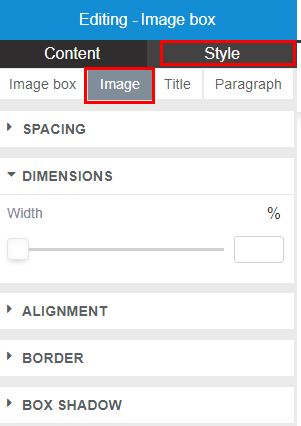
Style

Image
SPACING
  • Drag the slider button left or right to indicate the space (in pixels) between the image and text content items of the Image Box. Spacing is same as padding.
DIMENSIONS
  • Drag the slider button left or right to indicate the dimensions (in percentage) of the image. This is same as resizing the image as a percentage of the Image Box area.
ALIGNMENT
  • Align - set position of the image in relative to the text content - left, center, right. Default is left.
Left-aligned - aligned with a left edge. Right-aligned - aligned with a right edge. Centered - centered between two edges.
BORDER
  • Border radius - Set border radius (curvity in pixels) of Accordion items
  • Border style - Set border style of Accordion items i..e. thickness of the border around the accordion and between each item
BOX SHADOW
  • Box shadow - set the box shadow of the Image Box - Default, None, Outside, Inside. The box shadow property adds shadow effects around an element's frame.
    • Horizontal - offset of the shadow, positive means the shadow will be on the right of the box, a negative offset will put the shadow on the left of the box
    • Vertical - offset of the shadow, a negative one means the box-shadow will be above the box, a positive one means the shadow will be below the box
    • Blur -radius of the shadow, if set to 0 the shadow will be sharp, the higher the number, the more blurred it will be, and the further out the shadow will extend. For instance a shadow with 5px of horizontal offset that also has a 5px blur radius will be 10px of total shadow
    • Spread - radius of the shadow, positive values increase the size of the shadow, negative values decrease the size. Default is 0 (the shadow is same size as blur)
    • Color - set the color of the box shadow. If the color value is omitted, box shadows are drawn in the foreground color (text color). But be aware, older WebKit browsers (pre Chrome 20 and Safari 6) ignore the rule when color is omitted.
XRipe :  website builder imagebox element edit style image

Style

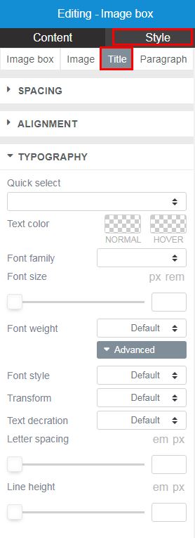
Title ( and Paragraph)
SPACING
  • Drag the slider button left or right to set the Spacing (in pixels) of the Title text from top edge of the Image Box.
ALIGNMENT
  • Align - set Title text alignment - left, center, right or justified
Left-aligned text is text that is aligned with a left edge. Right-aligned text is text that is aligned with a right edge. Centered text is text that is centered between two edges.
TYPOGRAPHY
  • Set the Typography options for the Title text
XRipe :  website builder image box element edit style title

XRipe :  site builder image box widget image align left
XRipe : site builder image box widget image align right


All Articles