Accordion Widget
Accordion Widget
Accordion Widget can be used to display text in a collapsed, organized and convenient manner. Accordions are generally used to break content into multiple sections. By using Accordion, you save space without truncating the content. By default, only titles of the content are displayed, a user has to click on the title to open/expand the hidden text or content. For example, an Accordion is a great way to display FAQ, since it allows the user to quickly and easily browse your FAQ topics (titles) without much scrolling.
To create a new or/and access the functionalities Accordion offers, do the following:
- Click on the Accordion Basic Element Widget icon
- Decide on where to drop the widget, using your mouse cursor and the green horizontal line
- Click on the location
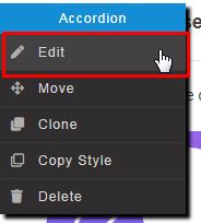
- Right-click on the widget to invoke the context menu
- Click Edit
- Select options, Fill-in necessary data (see below: Editing Accordion Element)
- Done, save your work as draft or publish
Editing Accordion Element
Content
|
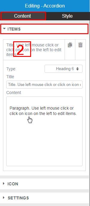
| ITEMS |
- To Add more accordion item(s) to the list, click on the copy icon

- To Delete accordion item(s) from the list, click on the trash icon
- Click on the accordion Item Box (2 in the pic.) to open the item properties
- Title Type Heading - Set the Title HTML tag used for the title to H1- H6 or Paragraph
- Title - Enter the title text for each item
- Content - Enter description text (Rich text format) for each item
|
| ICON |
- Type - select the icon to represent the action of expanding an item: None, Plus, Angle left or Angle right
- Position - indicate position of the icon for each item: Right or Left
|
| SETTINGS |
- Initial - select the initial state of accordion items: Collapsed or Expanded.
- Expanded - if expanded, then how many items should be expanded: One or Unlimited (all items)
|
Style
|
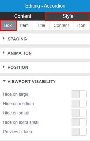
| Box (accordion) |
| SPACING |
- Drag the slider button left or right to indicate the Top margin (in pixels) between accordion and neighboring element on the page
|
| ANIMATION |
- Select animation option: Default, None or Animate
|
| POSITION |
- Position - inline or block.
|
| VIEWPORT VISIBILITY |
Viewport Visibility determines behavior (responsiveness) of the Accordion across devices - large, medium, small, extra small screens. Select how you want the accordion to adapt its state to various devices : hide or show. |
Style
|
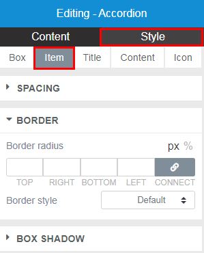
| Item |
| SPACING |
- Drag the slider button left or right to indicate the Margin (in pixels) between accordion items.
|
| BORDER |
- Border radius - Set border radius (curvity in pixels) of Accordion items
- Border style - Set border style of Accordion items i..e. thickness of the border around the accordion and between each item
|
Style
|
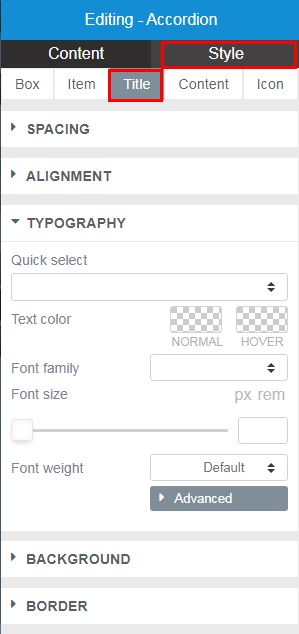
| Title |
| SPACING |
- Drag the slider button left or right to set the Inner Spacings (in pixels) of the accordion titles. Horizontal - same as left and right margins. Vertical - same as top and bottom margins.
|
| ALIGNMENT |
- Align - set titles text alignment - left, center, right or justified
Left-aligned text is text that is aligned with a left edge. Right-aligned text is text that is aligned with a right edge. Centered text is text that is centered between two edges. |
| TYPOGRAPHY |
- Set the Typography options for the titles
|
| BACKGROUND |
- Background color - choose the color of the titles' background
|
| BORDER |
- Border style - set border style of Accordion titles - Default, None, Solid, Dotted or Dashed
|
Style
|
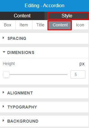
| Content |
| SPACING |
- Drag the slider button left or right to set the Inner Spacings (in pixels) of the accordion titles. Horizontal - same as left and right margins. Vertical - same as top and bottom margins.
|
| DIMENSIONS |
- Drag the slider button left or right to set a fixed, equal Height (in pixels) for the accordion content boxes. If no height value is set, then the each content box will adjust to the size of the text.
|
| ALIGNMENT |
- Align - set the accordion content boxes text alignment - left, center, right or justified
Left-aligned text is text that is aligned with a left edge. Right-aligned text is text that is aligned with a right edge. Centered text is text that is centered between two edges. |
| TYPOGRAPHY |
- Set the Typography options for the content boxes
|
| BACKGROUND |
- Background color - choose the color of the accordion content boxes
|
Style
|
| Icon |
| SPACING |
- Drag the slider button left or right to set the Inner Spacings (in pixels) of the accordion icon. Horizontal - same as left and right margins. Vertical - same as top and bottom margins.
|
| DIMENSIONS |
- Drag the slider button left or right to set the Size (in pixels) of the icon
|
| COLORS |
- Color - choose the color of the accordion icon
- Background color - choose the color of the accordion icon
|


